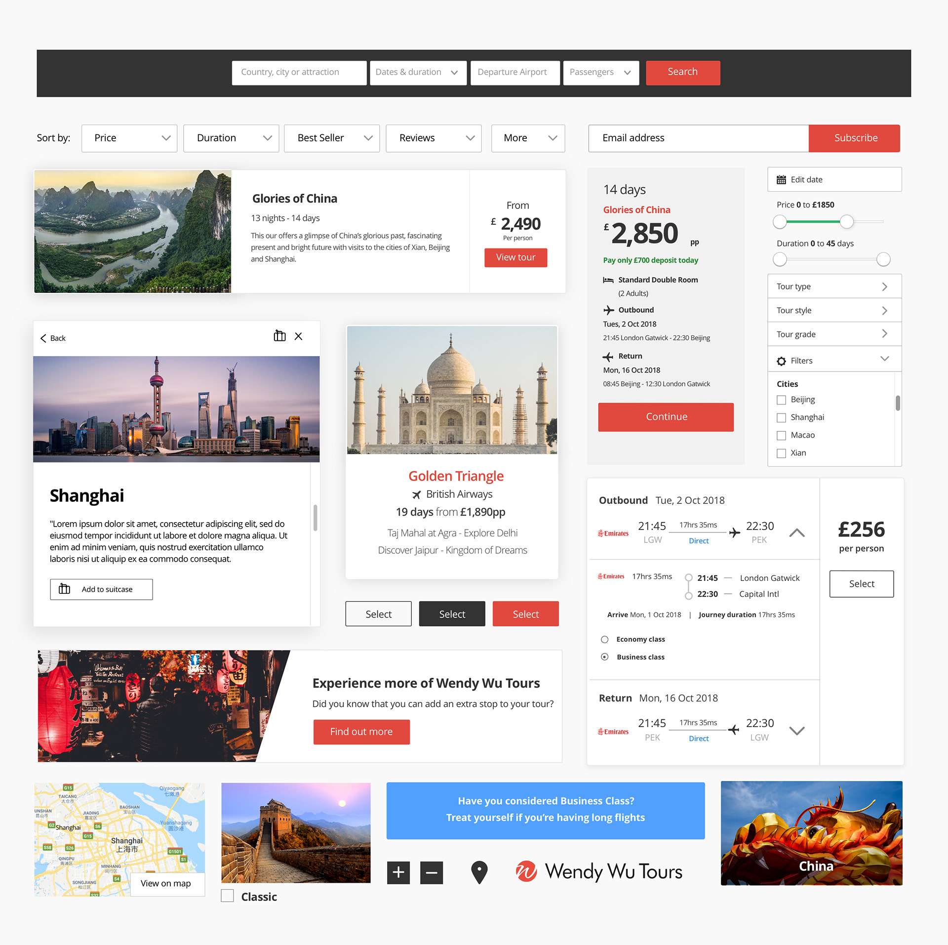
I found a very content-heavy website, with some intricate journeys and an unusual information architecture.
Before start designing, I wanted to map out the whole website, to spot pain points and understand how to enhance the entire user experience.
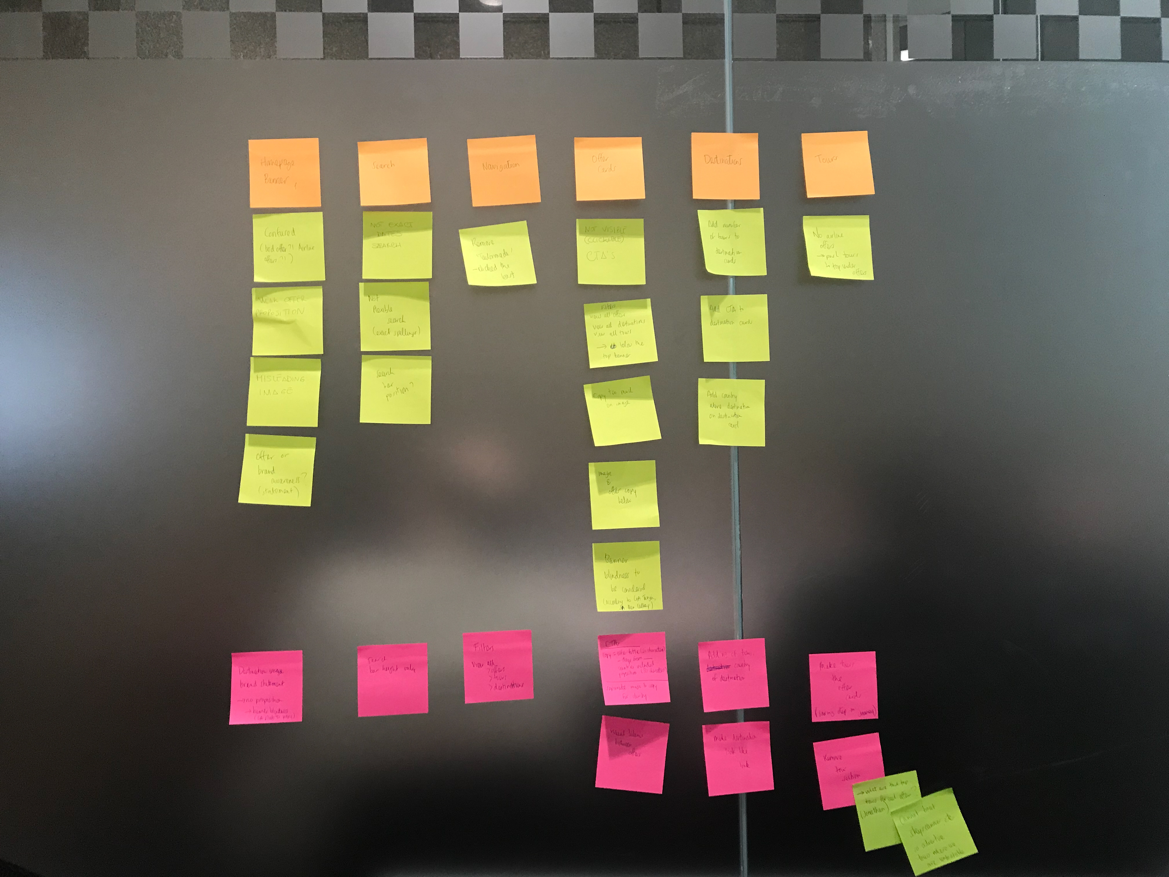
So I gathered feedbacks from my stakeholders, dividing their comments in categories: current issues, what's missing and nice to have. Afterwards me and the team created a backlog based on importance/urgency, then the wireframing process started.
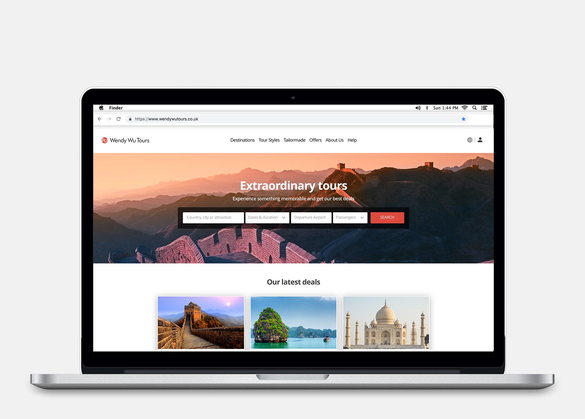
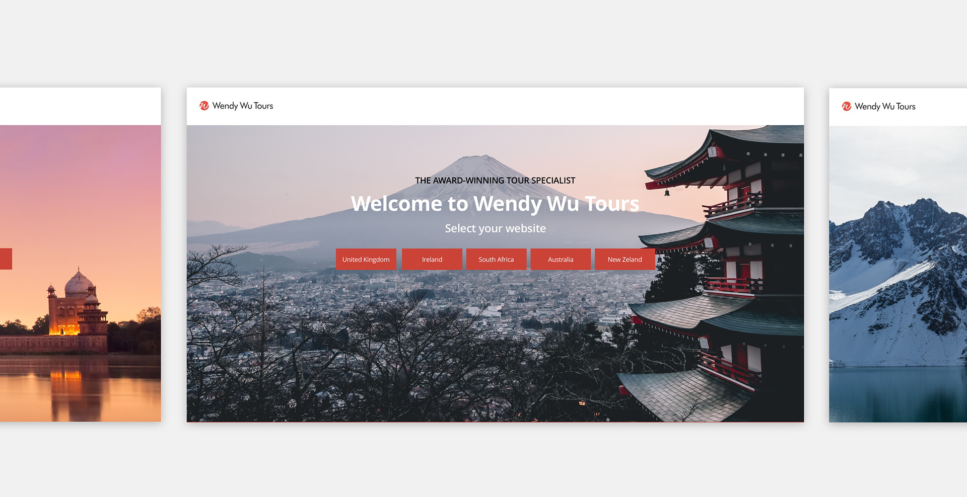
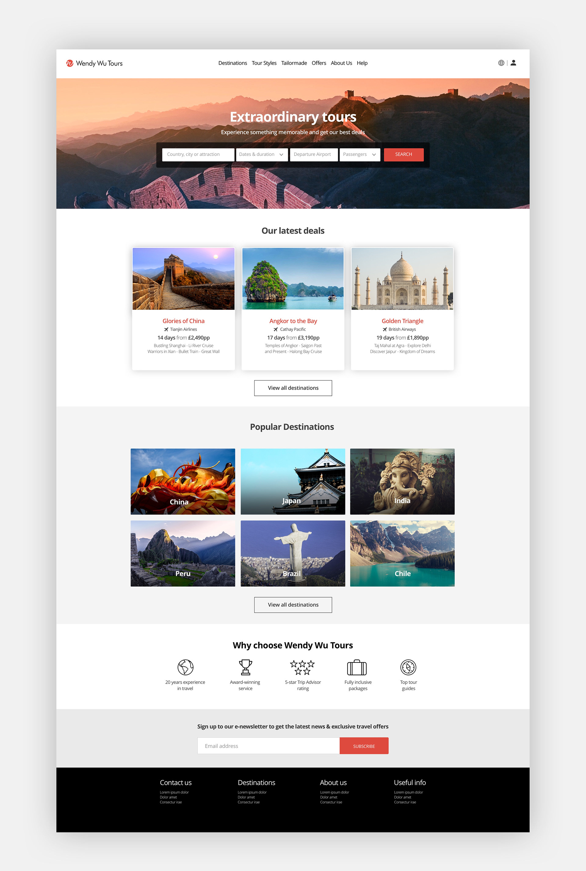
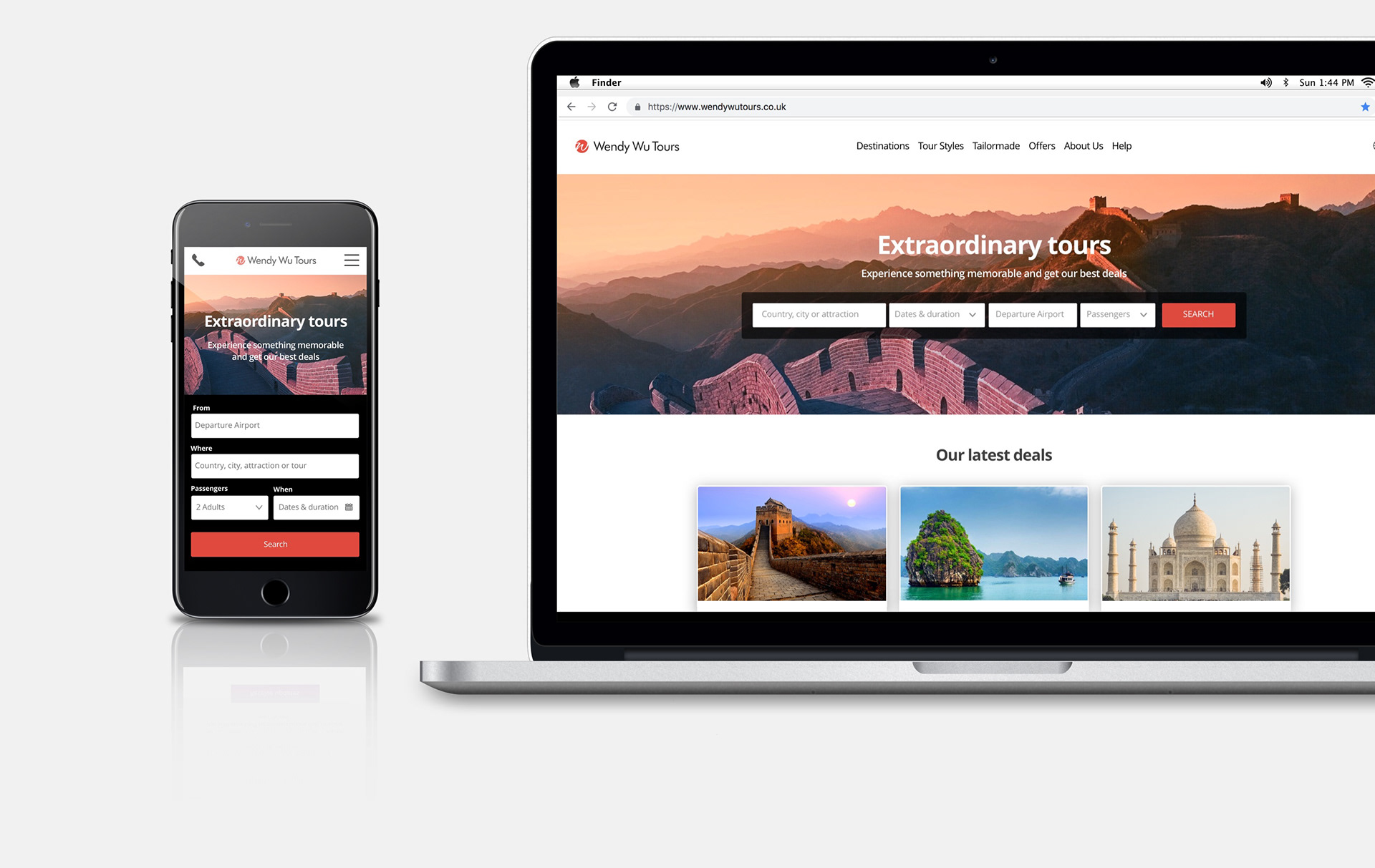
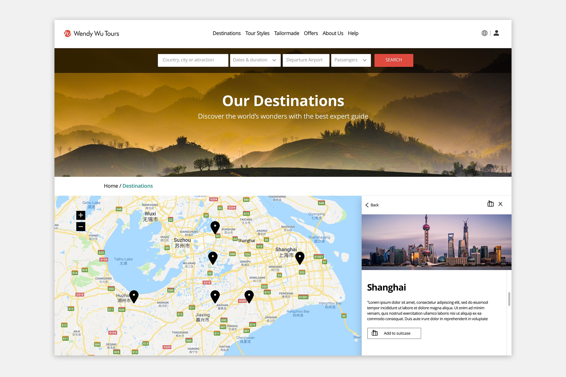
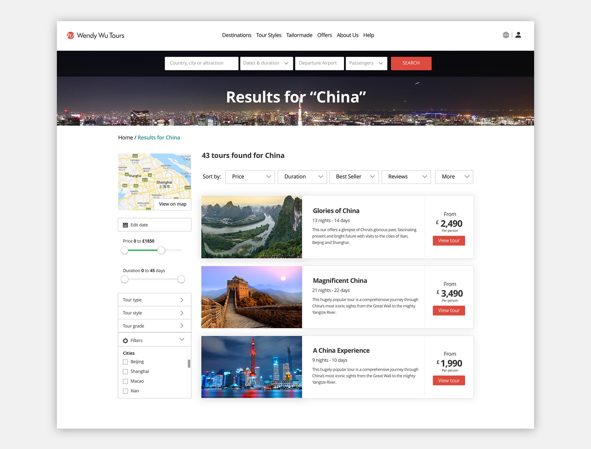
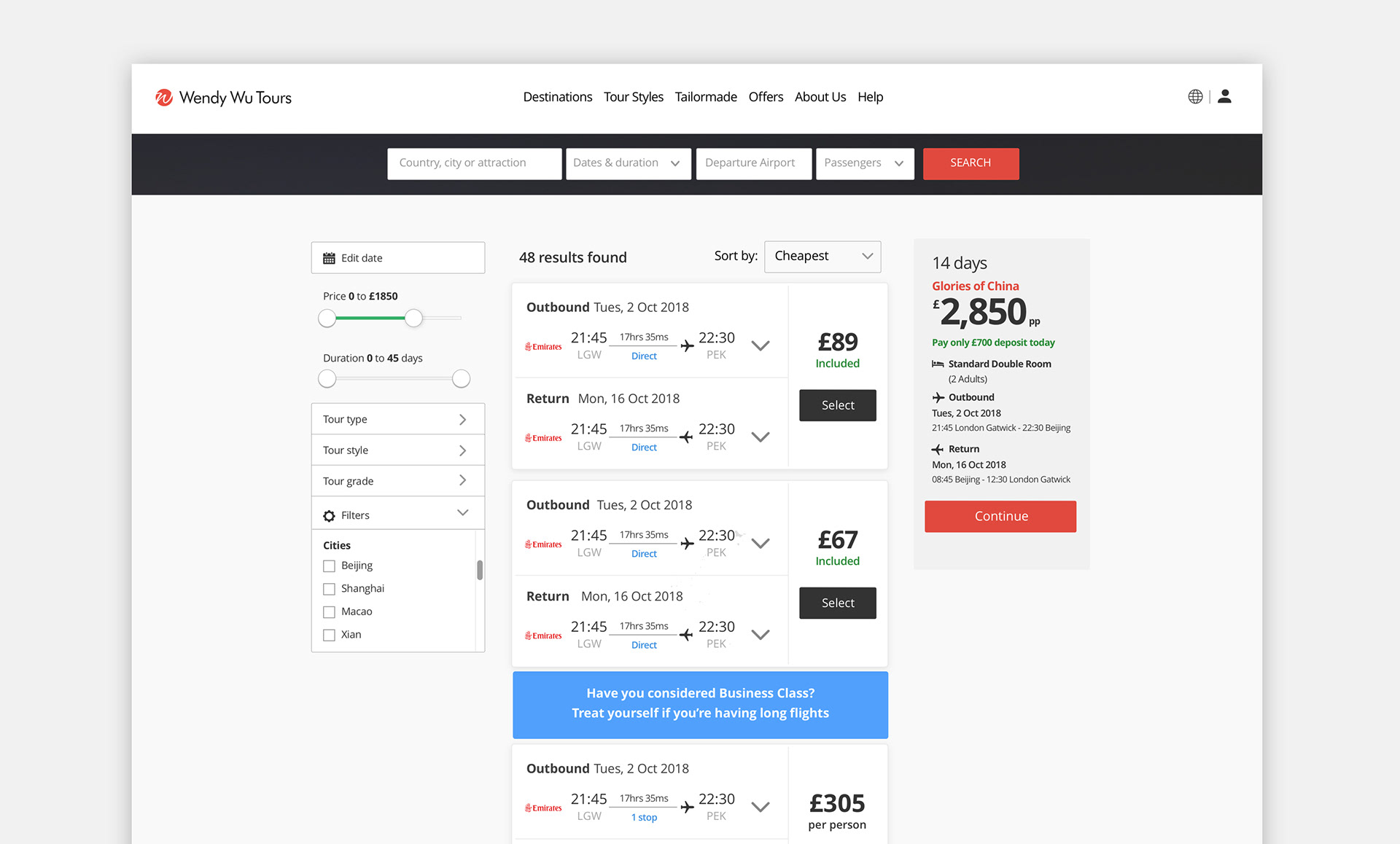
The designs below are the final step of the process, during which we ran few A/B and guerrilla tests to choose between components, icons, call to actions, etc.
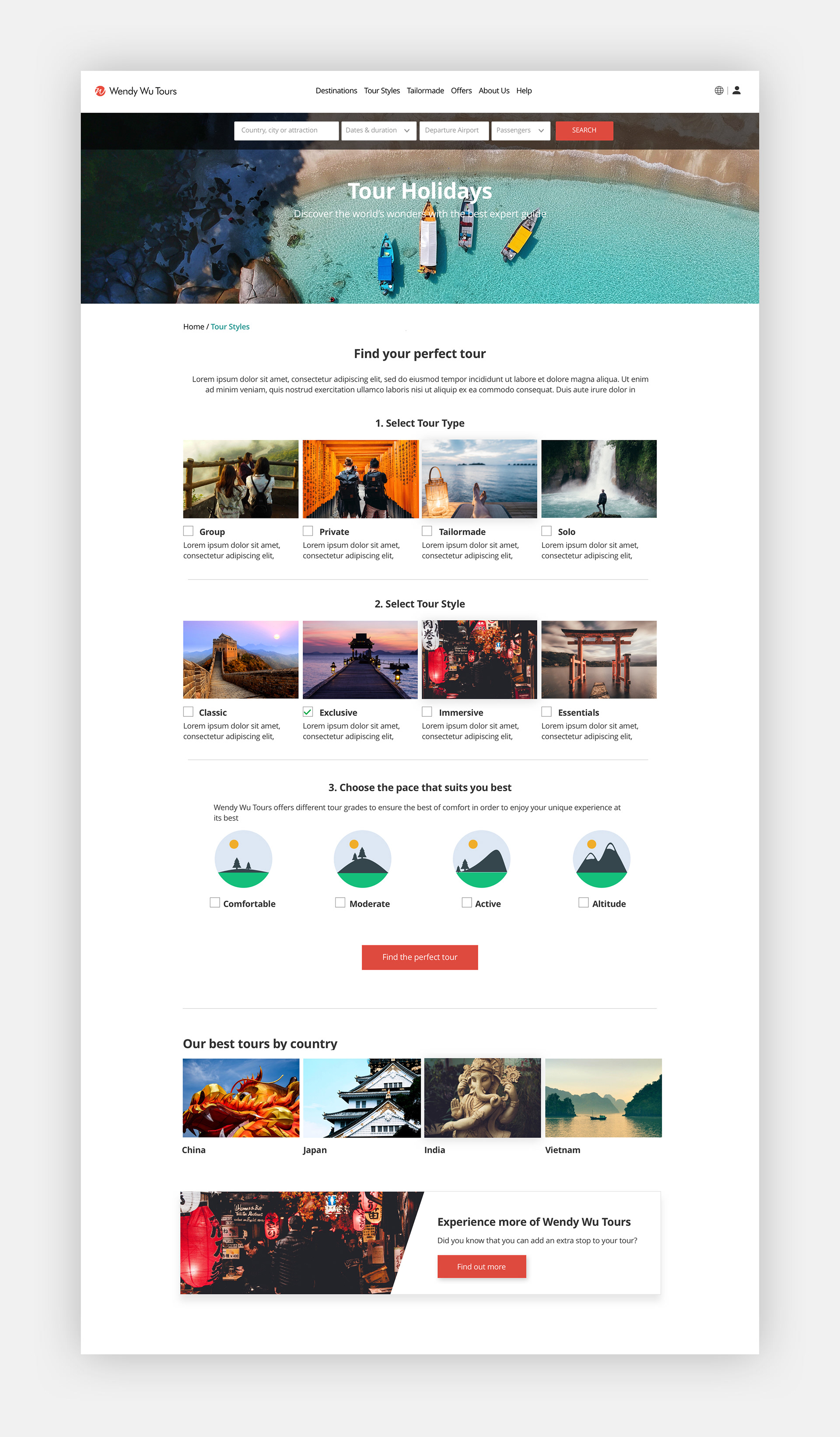
UI Components