Our Task
We were asked to redesign some web and app key screens regarding the hotel research journey, in order to enhance the user experience, create more engagement and eventually reach younger customers with a fresher look and feel.
We were required to keep similar contents but restructuring the information architecture where necessary.
Approach - Emphatise
First of all, we deeply studied the state of the current website, immersing ourselves in the product so we could get a deeper understanding of the issues involved.
We also talked with a number of people within the business and users, trying to capture as much as possible from their own experiences.
1. State of the current website
Focus areas highlighted in magenta.
Home - top area

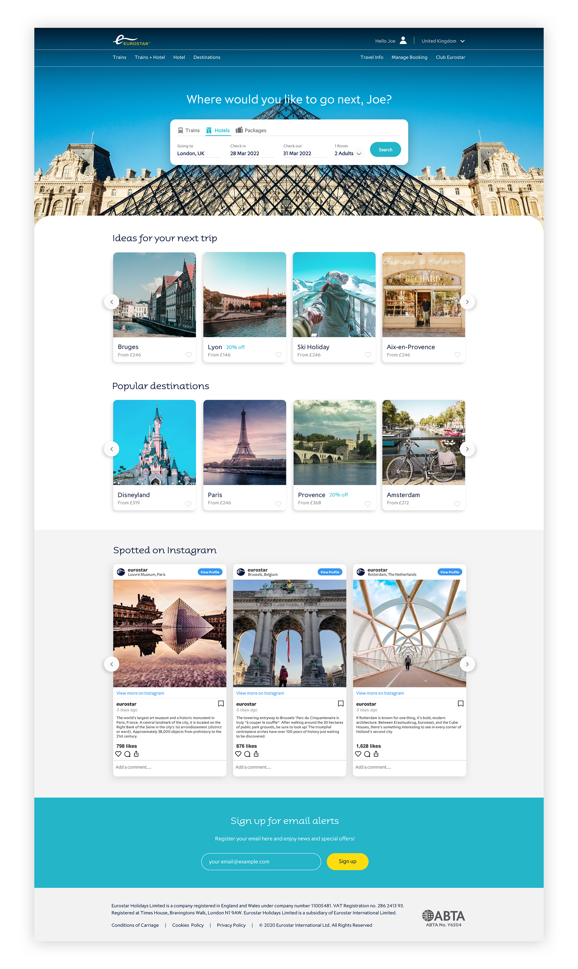
We felt that the layout chosen for this page area wasn't driving enough attention to the main functionality of the page: the search engine.
The optical focus seems to be bouncing between left and right to obtain informations and eventually complete a task. We found unusual that void in the middle of the page created by the two components.
Homepage - bottom
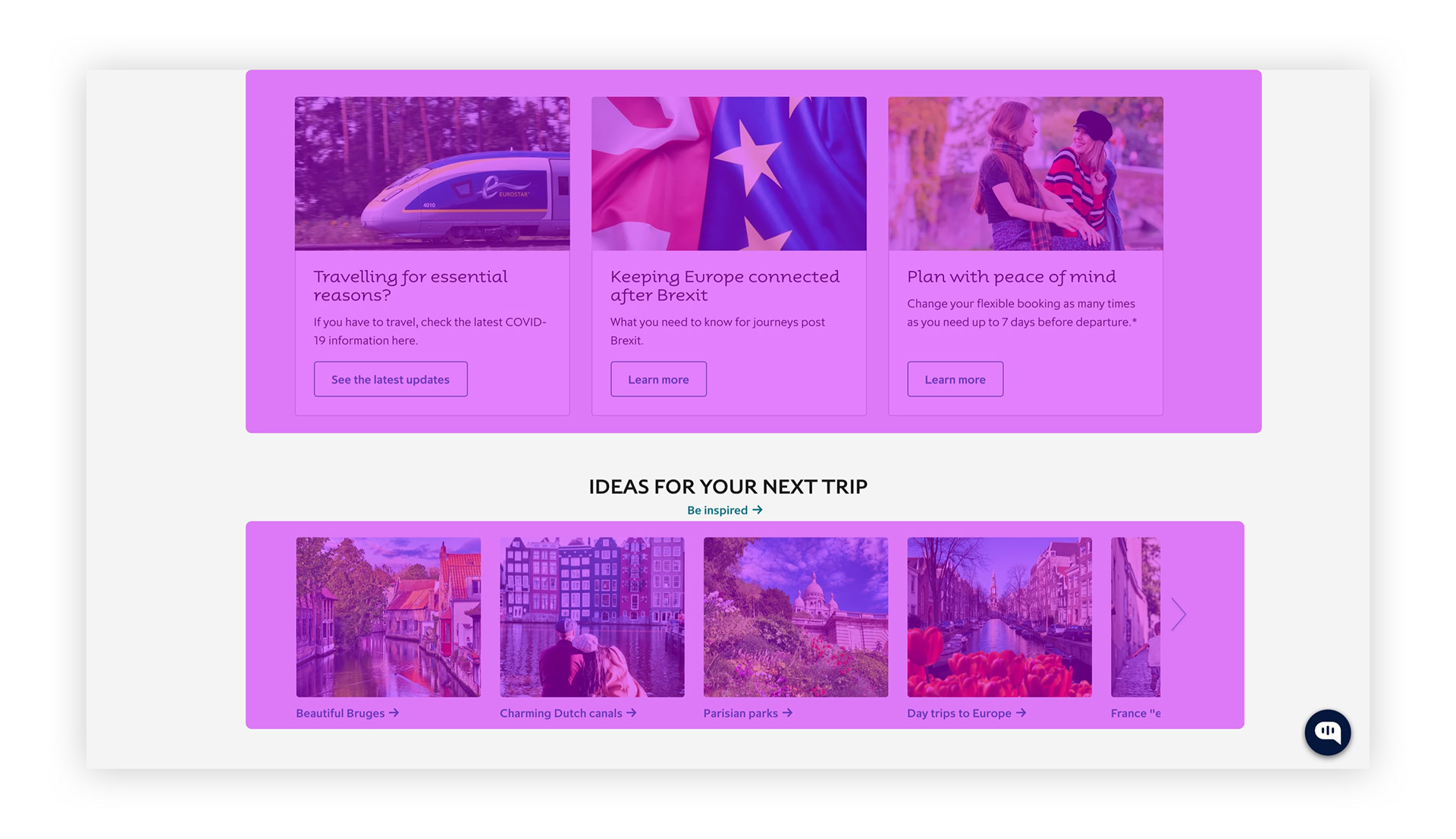
The bottom area of the homepage shows a lack of inspiring contents, which are expected by a generic user.
Sections like "popular destinations" or "recommended" are very common practice for travel website homepages and may increase customer engagement.
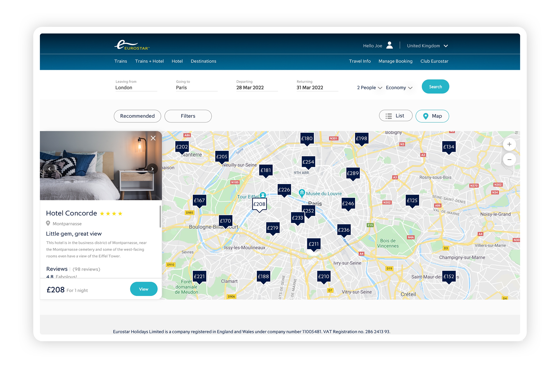
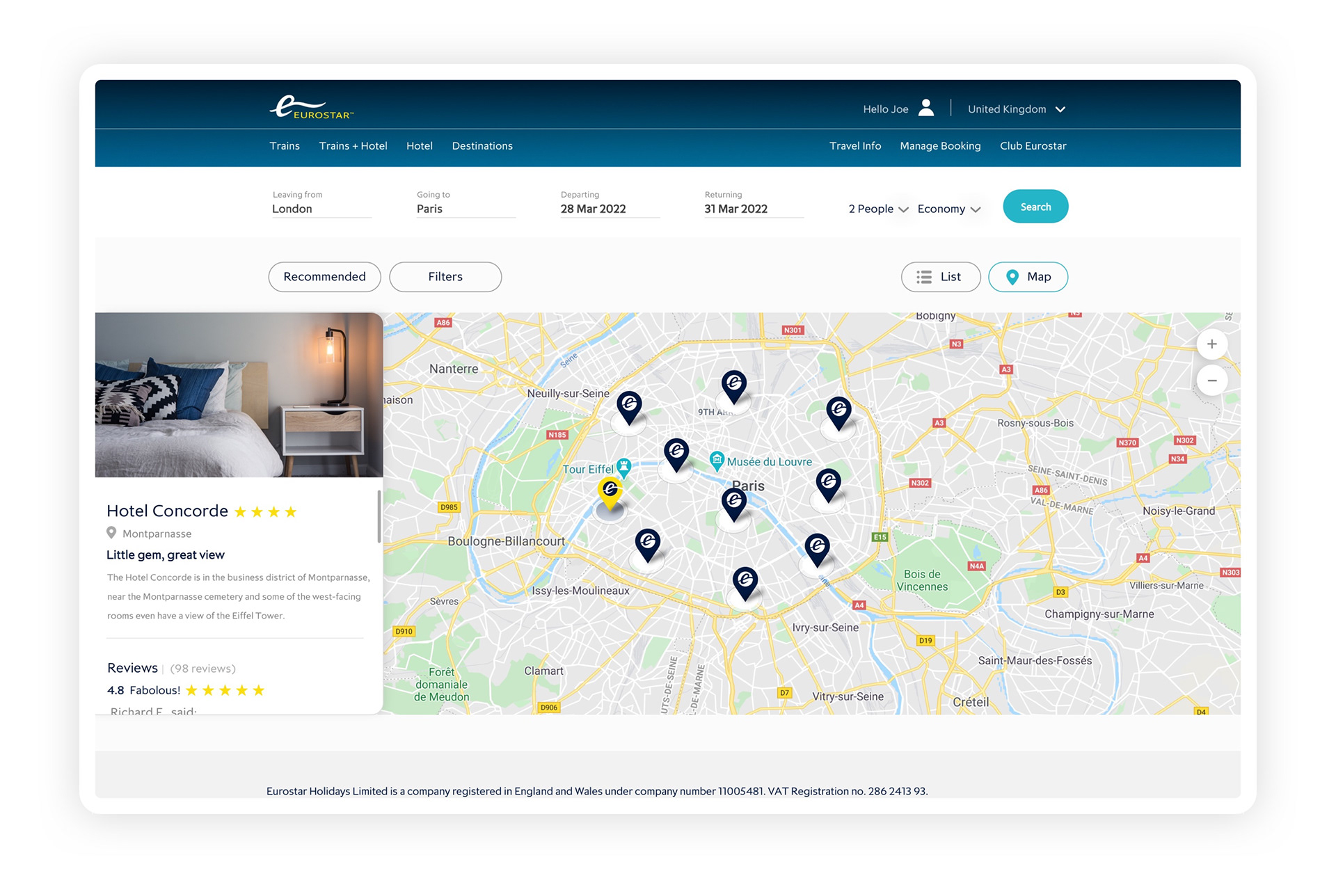
Hotel search page - map view
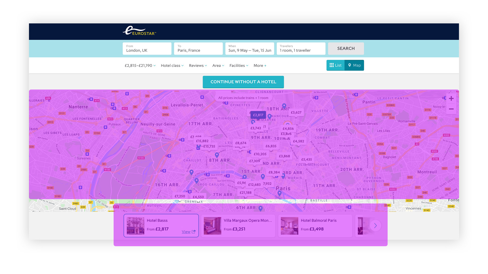
The user can use the map correctly but we found a very limited access to information and contents (imagery, reviews, etc).
2. Define
Afterwards, we started gathering all the comments and the insights and put them in order, based on areas and sections, so we could create problem statements.
3. Ideation - redesign
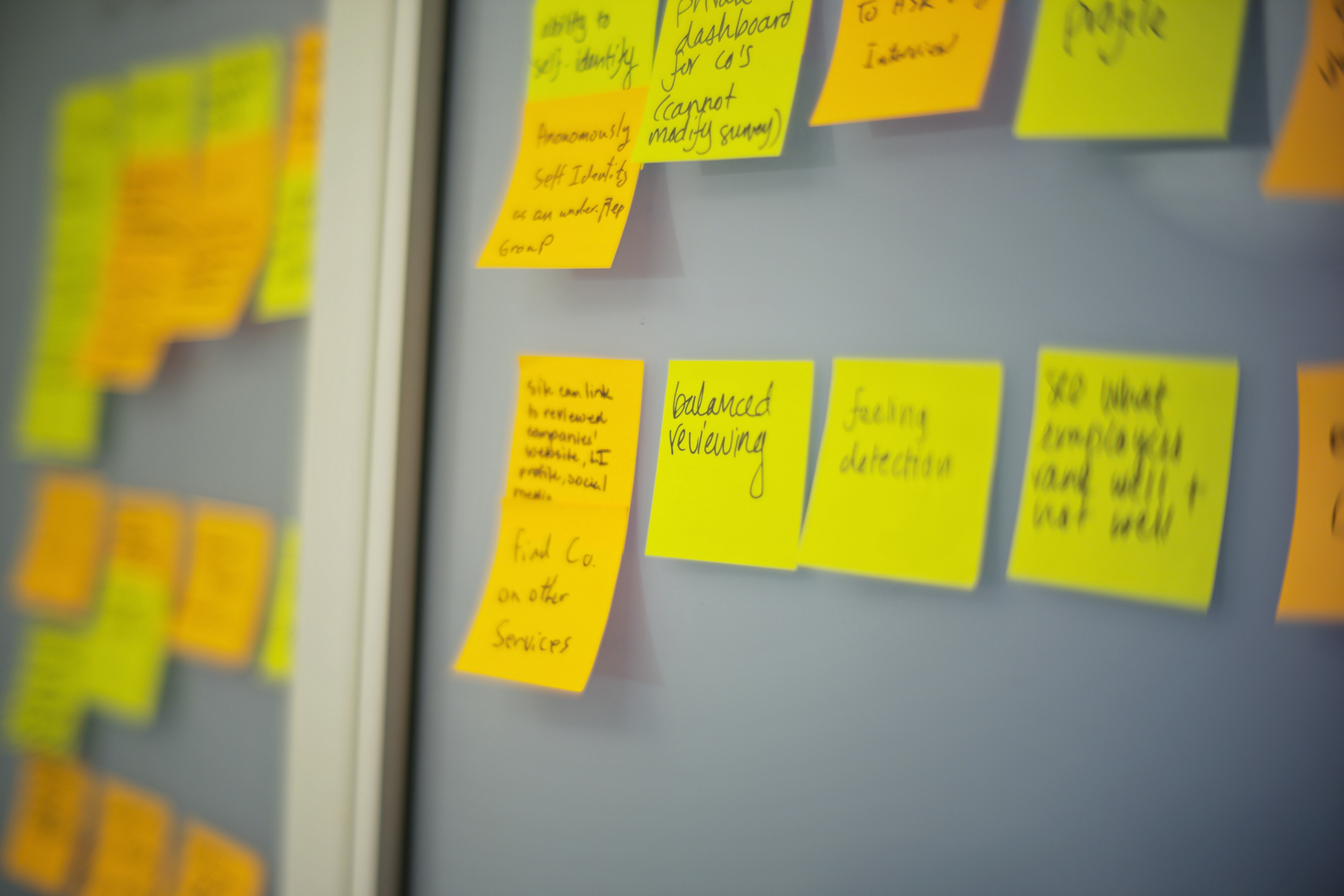
We started brainstorming to find solutions to our problems statements, organising a design workshop where everyone was welcome to sketch and present their own ideas.
Many other interesting idea and perspectives came out from the workshop, which added onto our own design research. All this knowledge were then translated in wireframes first, and mid fidelity designs after.
Once we created the screens needed, we quickly built a prototype and we were ready to test it. Below, some of the screens produced during the project.
Homepage
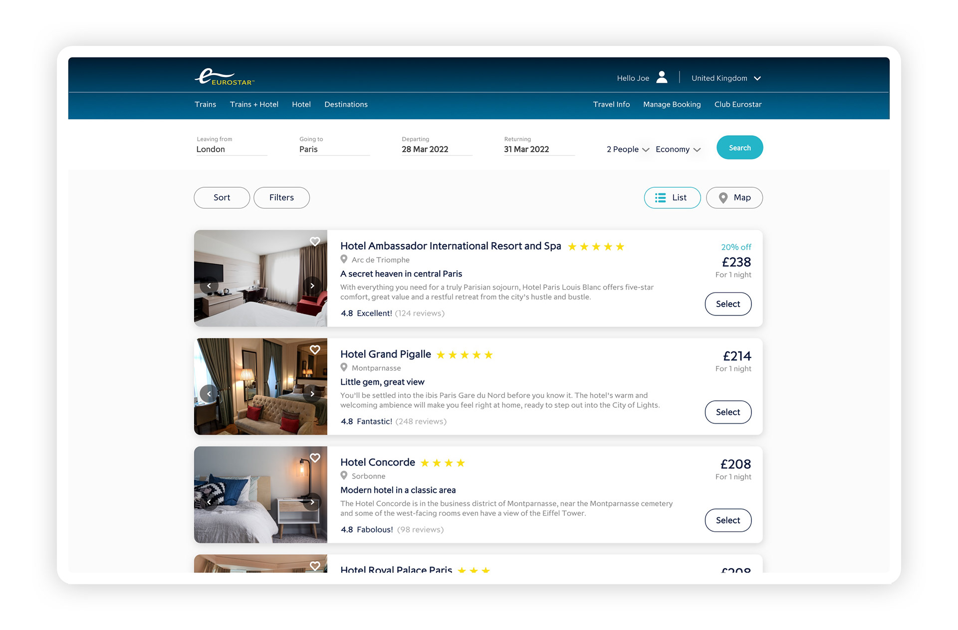
Hotel search - list view

Hotel search - map view
Mobile app concept
Home - hotel search
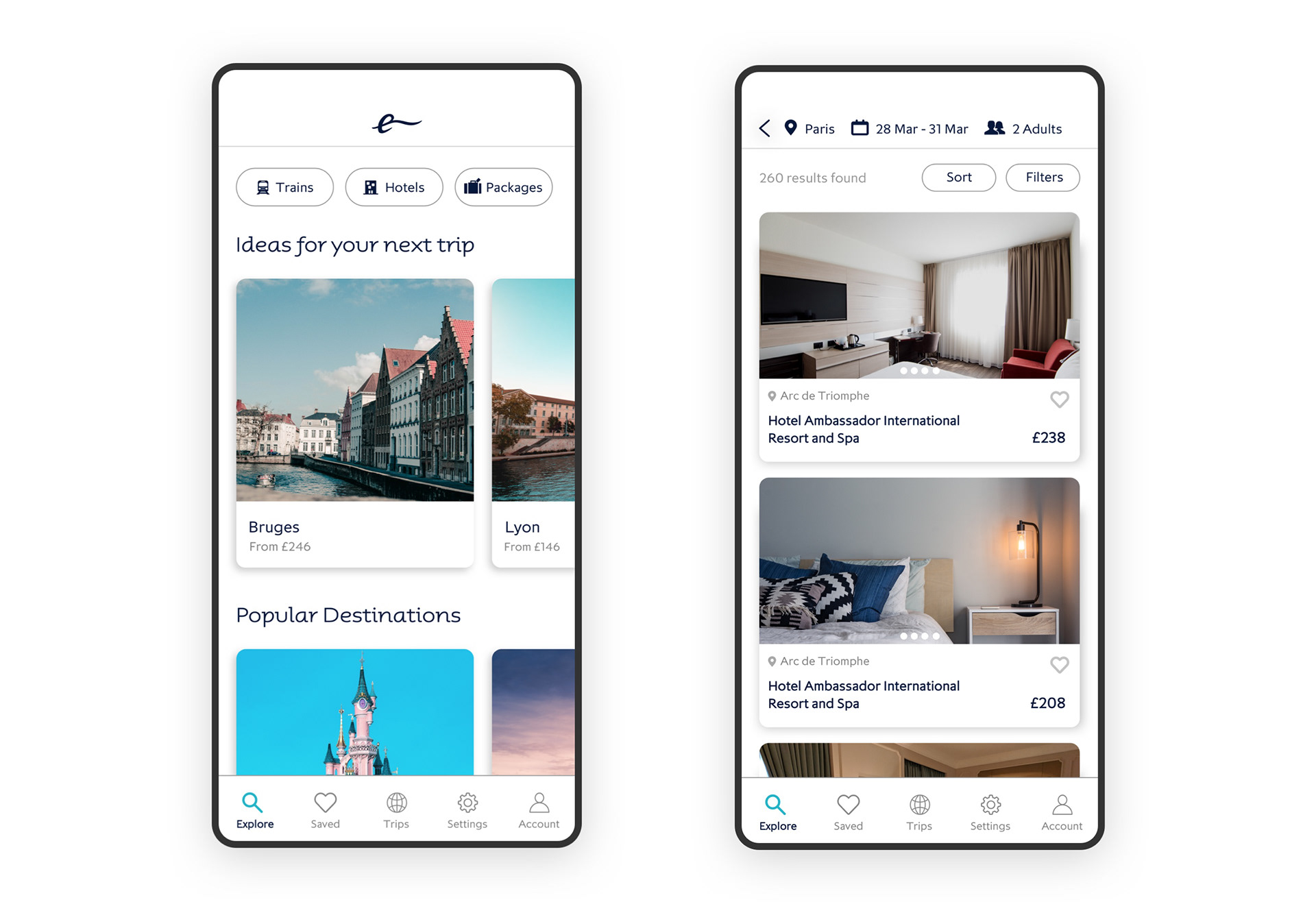
Hotel view

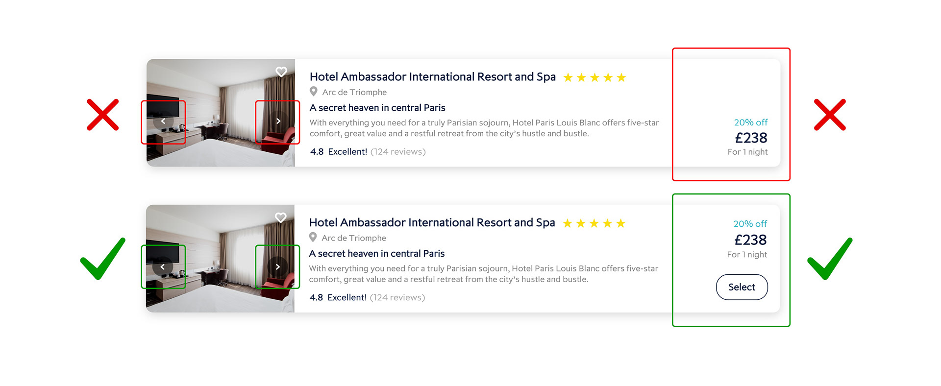
4. Test, iterate, test
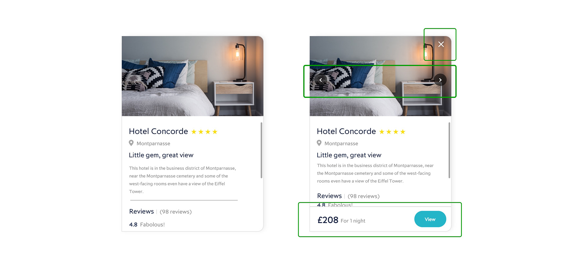
Finally, we tested our prototype. We assigned small tasks to complete for our users, and the majority were successfully completed.
We found out that some users were confused in some areas or missed some features, so after the testing session we had a quick design iteration session.
We tested it again, and the screens (below) were more intuitive, performing much better.
Old card VS new card
Full page with card iteration
Hotel search - map view iteration
Full page with card iteration